PARAMETRIC DESIGN AND 3D PRINTING


CONCEPT
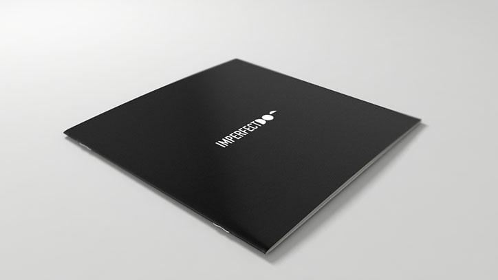
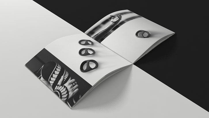
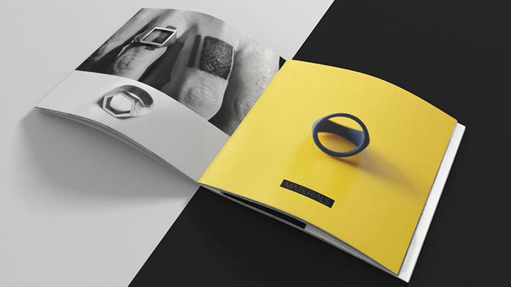
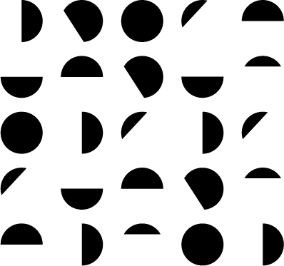
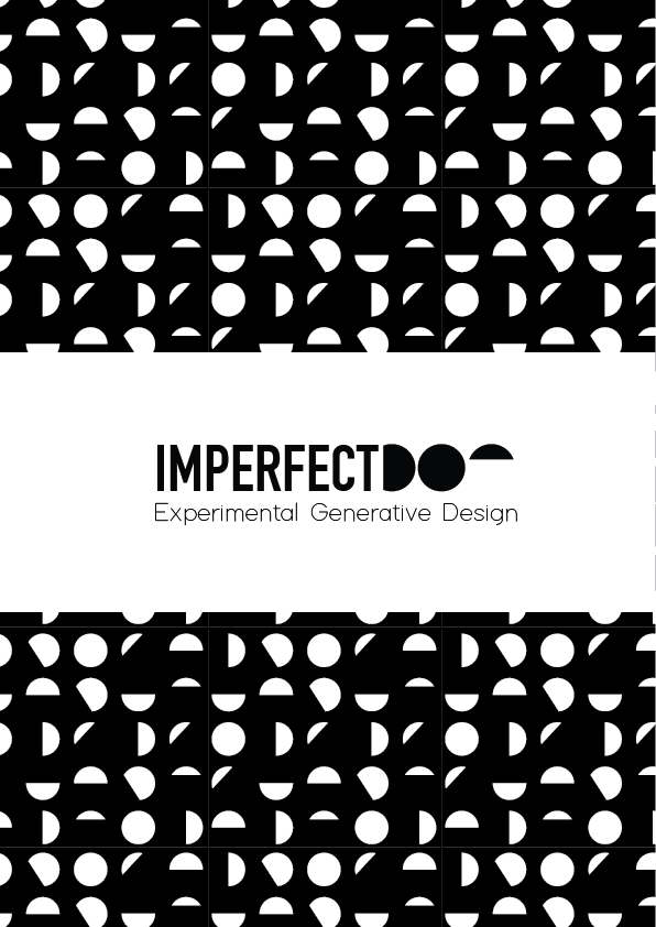
The logo design is based on the main element of Imperfect Dot’s collections, which is the parametrization of basic forms. In the same way the three elements composing the word “DOT” are based on the same circle with different cuts, realised in a parametric way. The font and colour choice want to give the brand a contemporary and urban style.
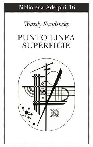
The brand name wants to recall the concept of relativity of a point, in its shape and relation to other objects, as outlined by Kandinskij in its Point and Line to Plane, which perfectly fits with the design process of Imperfect Dot’s collections. Every object is constructed from a starting point, its relation to other points, and the parameterization of those relations. Points, lines, and planes get together and - through mathematical formulas - build objects that can be transformed remaining faithful to their original matrix.
BOOKLET
PATTERN

Emanuele lapadula
Product & Graphic designer
E-mail:
emanuele.lapadula @gmail.com


